If pay-per-click ads are the welcome mat to the house of your business, landing pages are the entryway. The welcome mat may get people in the door, but the entryway convinces them to stay. The look and feel of your ‘entryway’ needs to be inviting and interesting to get your visitors to move forward in their relationship with your business. A good, engaging landing page is critical to gaining the conversions that are the meat of your pay per click ad, whether your defined conversion metric is driving traffic to your site, selling a product or gaining prospect contact information.
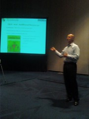
Sage Lewis of Search Engine Watch Expert and President of SageRock.com introduced this SES session on landing page optimization. Speaker Tim Ash, president of Site Tuners and landing page expert, brought his enthusiasm for his topic and his practical advice to this session of useful tips.
Tim began his session outlining several client case studies from SiteTuner to illustrate some key points about landing page testing:
- Landing page testing can greatly improve your conversion rate
- Really subtle changes can make a big difference
- Even a small increase in conversions can translate into big numbers for companies with large revenue streams
- Good landing pages can be improved
- You don’t need a lot of data to perform testing. As few as 10 conversions a day are sufficient for A/B testing
Essentially, landing page testing can help any size company at all stages of the pay-per-click process. However, before launching in to tweaking and tuning the details of a landing page, a good campaign needs a solid landing page design to begin with.
Tim posed an important question to the audience: “Who should design your site?”
He doesn’t think the ad agency, marketing department, IT guys, the webmaster or your boss should be primarily responsible for this endeavour.
“Embrace the hoard of barbarians. They are going to define your brands,” Tim said. The “hoard of barbarians” he jokingly refers to are your customers. Tim recommends designing a landing page your customers would like to visit and can easily interact with.
Tim then outlined several important considerations in deciding how to go about testing your landing pages.
- Test size The amount of data a business has to work with will determine which size of test to work with. A/B test is the simplest, but with enough data companies can test thousands of different landing page versions.
- Test configurations Test can be set up to be either restricted, with a limited number of changes, or free form, with as many variables and changes as you like.
- Data collection With full data collection, samples are taken collectively. With fractional factorial, data is sampled randomly.
- Data analysis Use either parametric or nonparametric data to analyze the results of your test.
Once a business has taken these factors into consideration, they can then move forward with the type of test they wish to perform on their landing page. The three main types of landing page testing Tim outlined include:
- A/B split testing Simple to implement and track, A/B testing involves changing one variable at a time and sending equal traffic to all versions of a landing page.
- Parametric multivariate testing A landing page will generally need data upwards of 50 conversions a day to implement this type of testing.
- Non-parametric testing A large scale test which takes interaction between variables into account.
While describing these three types of tests, Tim underscored the importance of monitoring how each changed variable interacts with one another in order to discover the ideal combination of changes you should make to your landing page.
Tim finished off his session by outlining the “Seven Deadly Sins” committed by landing page creators. This list of pitfalls covers a range of mistakes that can greatly impact landing page success.
- Squandering attention Avoid having too many links and distractions on your landing page. Focus on the visitor’s goals and eliminate clutter.
- Frustrating users Make it easy for users to reach their goal. The design of your page should guide people to the conversion.
- Invisible risk reducers Advertise the fact that your site is safe and user-friendly. Prominently display any “hacker-safe” guarantees, and let people know important information up front, such as which credit cards your site accepts.
- Lack of social proof Transfer the trust of larger brands and your clients to your company. Display client testimonials and case studies, media coverage or endorsements on your landing page.
- Surprising or confusing visitors Eliminate distracting elements like pop-ups, and avoid forcing visitors to register or create an account to purchase. Don’t interrupt the conversion process.
- Ignoring your baseline When testing landing pages, be sure to collect data on your existing landing page and not just your variations. Any changes should be compared against a constant.
- Not collecting enough data Ensure you run your landing page tests for long enough to gather sufficient data. Higher numbers further substantiate which pages are working and which aren’t.
Tim was able to give a great, easy-to-follow overview of landing page testing. It also didn’t hurt that he handed out $20 to anyone brave enough to answer the questions he posed to the audience. By following his guidelines and being sure to avoid the “Seven Deadly Sins,” you can help ensure your landing pages are optimized to best attract and convert your users.
Stay current with the SES San Jose conference by checking in regularly with the TopRank Online Marketing Blog, and view more photos from the TopRank Team at TopRank on Flickr.


