I’m not a designer. I’m not artsy. I didn’t even stay at a Holiday Inn Express last night.
I’m a writer to the core. But, as much I love words, I recognize that they don’t jump off the screen and grab people’s attention. Let’s face it: even the most beautiful prose is pretty ugly, from an aesthetic standpoint. You’re not going to find a framed portrait of blocky text hanging at the Guggenheim anytime soon.
As a marketer who is admittedly lacking in design skills, I’ve done an awful lot of reading on the subject, and I do my best to soak up knowledge and advice from the awesome group of visual wizards here in the TopRank Marketing design department.
My belief is that any writer who wants their work to be seen should be seeking to sharpen expertise in this area.
Design is Essential to Content Marketing
A compelling and unique graphic on a social media link can be the deciding factor when it comes to earning a click. Once a visitor arrives at a blog post, they’re liable to quickly move on if there isn’t an eye-catching visual to immediately pull them in.
These statistics help portray the vital importance of keeping design front-and-center:
- Posts with images produce 650% higher engagement than those with text only.
- Our brains process visuals 60,000 times faster than text.
- 65% of people are visual learners.
- Social media posts with images drive far more engagement across all channels.
“Design is content,” asserts Patrick Pineda, motion designer for TopRank Marketing. And he’s right: treating visual elements as separate add-ons for your content is a mistake. Without the help of integrated imagery, great writing can easily go unnoticed.
Treating visual elements as separate add-ons for your content is a mistake. - @NickNelsonMN #ContentMarketing #Design Share on XThe trouble, of course, is that your design department may be stretched thin or you need super quick turnaround. And while this is never an ideal scenario, if the need arises, you can create simple, professional-looking visuals that enhance your content by adhering to a few simple guidelines.
1. Find a Tool You Love
The emergence of user-friendly apps for graphic design has been huge for folks like me. No longer must we stare blankly at a Photoshop interface while trying to figure out the functional differences between three different paint-brush icons.
There are plenty of different options out there for executing simple design tasks. Find one you like and take some time to get comfortable with it. These apps are usually free up to some level, and offer efficiencies like drag-and-drop editing and templates.
Here are a few worth trying:
- Canva: My personal go-to. Tons of templates, backgrounds, and free illustrations you can use.
- Desygner: Very similar to Canva, with a focus on straightforward ease of use.
- Piktochart: An intuitive tool for creating infographics.
- Pixlr: Super helpful for quick photo editing and resizing.
- PicMonkey: Paid app with robust feature set
Here’s an example of a recent ad template in Canva. It’s sharp and simple, and if the design and dimensions are what you’re looking for, all you need to do is edit the text.

2. Think About Design at Every Step
Don’t treat visuals as an afterthought. Instead, build them into your content planning. When developing new concepts, think not only, “How can I write about this in a compelling way?” but also, “How can I illustrate these ideas?”
Just as written content should be strategic and purposeful, so too should visual content.
“I always ask: What’s the story? Who’s the audience? Where will my design reside?” says Pineda.
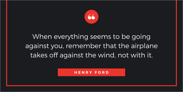
Here’s an example of a pull-quote design template from Canva. Whether you’re conducting an interview or there’s a specific takeaway you want to call out in your writing, consider turning it into a graphic to add a little pizzazz.
3. Simplicity is Golden
Our eyeballs are drawn to striking visuals, but they’ll be quickly repelled by overly busy graphics. Focus on conveying the necessary information as clearly and cleanly as possible. Modern design is often defined by its simplicity (think Apple or Nike).
In the words of Antoine de Saint Exupéry:
It seems that perfection is attained not when there is nothing more to add, but when there is nothing more to remove.
4. Colors Have Feelings
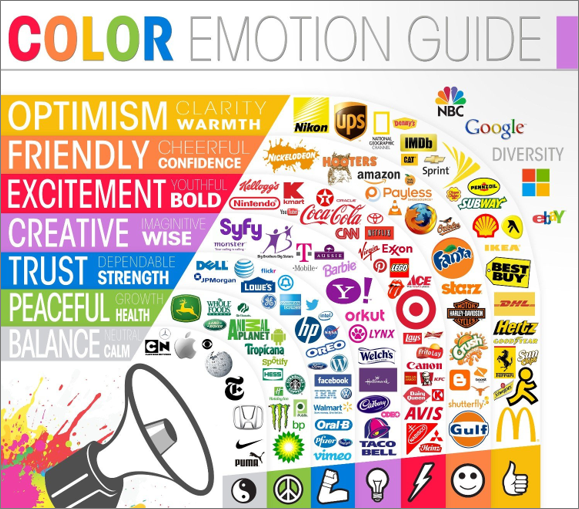
Be thoughtful in your color choices. Not only is it important to stay on-brand, but colors also encompass their own spectrum of emotions. This awesome Color Emotion Guide infographic from Visually offers a framework:
5. Get Creative with Fonts and Layouts
The trouble with using free online design apps is that, well, lots of other people use them, too. And when you’re relying on the same default fonts and templates, your productions will inevitably end up looking like much of what’s already out there.
Whenever possible, add unique touches and flares. Maybe your company’s designers are too busy to create graphics for each blog post you write, but can provide a few customized templates or fonts for you to upload and use.
Make sure you’re balancing creativity with readability. Poppy elements to catch the eye are critical, but you always want viewers to easily find and understand the message.
When it comes to designing visual content elements, balance creativity with readability. - @NickNelsonMN #ContentMarketing #Design Share on XAn Eye on Better Marketing Design
When I need a high-quality visual asset for a client, our tremendously talented TopRank Marketing design team is always my first stop. But for quick one-off graphics to promote or accompany a blog post, these practices have proven really critical.
The design below took all of 10 minutes to put together in Canva. Honestly, the majority of the time was spent on finding just the right background photo. But, it looks pretty sharp, if I do say so myself.
If you can find the time, I recommend taking introductory design classes or working alongside your design team to see what you can pick up. Any skills you’re able develop in this regard as a writer will be helpful as we forge ahead into the era of content saturation and shortening attention spans.
Speaking of captivating visual imagery, there may be no more important platform to add some of that wow-factor than on social media. But you have to select the right visual content for the right platform. Learn best practices for choosing effective social media visuals.


