 As a disclaimer before his session Jason Falls (@jasonfalls) admitted that there were probably 5-10 more qualified individuals in the room for the presentation. But he was the one chosen for the job! One of the reasons being that he could distill (similar to his favorite bourbon) mobile down into easy to consume information.
What we learned in the session was what we should be paying attention to, and what is the “star trek” B.S. that we shouldn’t be paying attention to yet. Jason’s presentation was flush with factoids, his take on mobile, and a no B.S. approach to optimizing mobile for customer experience.
Spit-Balling Some Mobile Stats
Another disclaimer – Jason didn’t include his statistics on his presentation slides but did note that the majority of his information came from Tom Webster, comScore, Nielsen, and mobithinking.com. Did you know:
- 54% of Facebook users visit via a phone
- 1/3 of those people use phone to access Facebook more often than other devices
- ¼ of status updates are made by phone multiple times per day
Understand That Your Audience is Not You
“If 54% of Facebook users access the platform via their phone – that means that 46% of them don’t.” – @JasonFalls
It is human instinct to focus soley on the large number that validates which direction we as marketers are leaning towards. When you’re determining where to invest time and money, make sure that you balance both sides of the equation.
- 87% of people are now on cellular phones
- Mobile devices account for 9% of all website hits
What do people do with their phones?
In more technologically advanced countries smartphones are used for nearly all online browsing. U.S consumers prefer mobile for things such as banking transactions, travel booking, shopping, and local information. In fact:
- 1 in 8 Americans will use mobile commerce by 2015.
- 1 in 4 applications are not opened more than once.
- 1 in 8 Americans compare prices on their mobile phones
- However, 7 in 8 do not …
Mobile Optimization & Design
When asking if you should create a mobile site, be aware that 80% of website visitors will leave if your website is not optimized for mobile. However, don’t let that statistic scare you off. If you are going to tackle a mobile site, just make sure it’s done right.
There are some new advancements in web technology that allow companies to create what is called a Responsive Design. In a nutshell this type of design will change the layout and appearance of a website based on the device or browser that it is accessed from. There are alternatives to Responsive Design that may be at a lesser cost but feel out the marketplace and don’t be afraid to ask your developer what it would cost.
The Good & Bad of Mobile Marketing & Applications
Any time a speaker shows examples to back up their opinion I am a big fan. Jason Falls did not disappoint! Below I have included some of the good, bad, and ugly that Mr. Falls shared with the audience as well as one or two I found on my own.
P.S. – Please disregard my 67 iPhone application updates in the photos!
Best of Mobile & Application: The Mermaid Inn
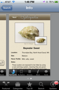
This New York establishment has 3 locations and a great mobile strategy. Their mobile site is easy to navigate and prompts users to download their “Oysterpedia” application. This application is not a sales tool for the company, instead it educates their audience on identifying different types of oysters.


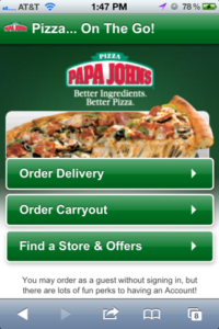
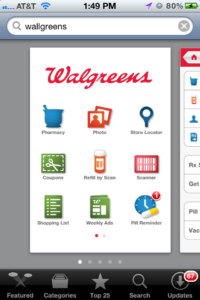
Easy Food & Refill Ordering: Papa Johns & Wallgreens


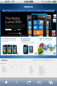
The Ugly: Nokia & Makers Mark


TopRank Readers Bonus: My Q&A with Jason Falls
What insight can you share into optimizing your mobile strategy to meet customer needs?
The vast majority of businesses either don’t have a mobile site or direct mobile users to their main site, which is designed for the desktop screen … which is to say they don’t have a mobile site. So the biggest optimization strategy that needs to be communicated is that you must develop a mobile version of your site, or use techniques like responsive design to present your site’s information on a 3-inch screen in a easy-to-read and use way. If your audience has to zoom, pinch, scroll or even squint to accomplish the main 1-2-or-3 things they visit your site for, you have failed and have essentially said to them, “I hate you and don’t want your business.”
For those that have a mobile site and are looking for something more in-depth to optimize, it would be to distill your site’s purpose down to a maximum (yes, maximum) of three things the mobile user visits your site for, then make the site kick ass at those three things. For example, PapaJohns.com (a mobile optimized site, not an app or other gimmick) gives you three choices – order a pizza for delivery, order a pizza for pick up or find a location. If you want investor relations, the story about John Schnatter’s camero, a company directory or human resources, you’ll have to visit the site on a computer. Papa John’s knows that mobile visitors only really want one of three things. And they deliver just that … along with your pizza, one would presume.
What is a no B.S. prediction you have for 2013 as it relates to companies evolving their mobile strategy to become more social?
That 90% of all apps developed by businesses will be downloaded once, then forgotten about and never opened again. Brands still don’t get content. They still don’t understand that the content you deliver that appeals to and attracts an audience isn’t about your sale items or your promotions. It’s about what’s useful to the audience. Companies and brands are going to build apps to buy their crap, which customers are going to hate. The ones that build interesting supplements to the customer experience will win.
For example, the Mermaid Oyster Bar in New York City has a great mobile website that serves the purpose of delivering location info, the menu and a link for reservations. Their mobile app is called Oysterpedia and has nothing to do with their restaurants. It’s an information resource about the dozens of variations of oysters in the world that allows users to learn, share and bookmark their favorites for future reference.
Who rocks a better moustache? You or Lee Odden?
If you consider the mustache alone, I’d call it a draw. If you consider the complete goatee, I’d still call it a draw. But if you consider the facial hair as a whole, I have the brow. Bow to the brow, Mr. Odden. Heh.


