What picture of your brand are you painting in social? I don’t mean metaphorically, I mean what visuals are you using to represent what you do and what your audience cares about? Study and after study indicates that visual content is far more impactful in social than its text-only counterpart, and yet a majority of brands interacting in social aren’t adjusting their content mix accordingly.
Cliches are Cliches Cause They Work
“A picture is worth a thousand words.” We’ve all heard the phrase, and for good reason. Especially when it comes to engaging your audience in social. Laura Roth, of Incisive Media, moderates today’s session focused on ‘harnessing the power of visuals’ in social.
Krista Nehrer, CEO of Boot Camp Digital, is the first presenter and she wastes no time to ‘prove’ images have more impact. Nehrer shows an image of a baby on the screen in the conference room. It flashes for only a moment, but when asked, the audience is able to describe the image to a T. More than simply proving recall, the audience also responded to the image with emotion.
She then flashes a ton of text on the screen. Again the information is only shown for a moment. This time, the audience falls silent. We were not only unable to recall a majority of the information, we (or at least I) felt no emotion in reaction to the flashing text. Science actually supports that an image is worth a thousand words! Take that 8th grade science teacher who yelled at me for doodling.
The 3 R’s of Pictures
Nehrer introduces her 3 R’s of creating quality images.
- Real Pictures
- Real Things
- Real People
Her point is simple and clear. People respond to images they relate to. So real photos taken of real things by real people is far more relatable, than say, my 8th grade doodles or photo shopped creatures.
Translating these best practices to social, Nehrer points out that using images in social requires an understanding that real images drive real engagement.
Instagram & User Generated Content is Growing
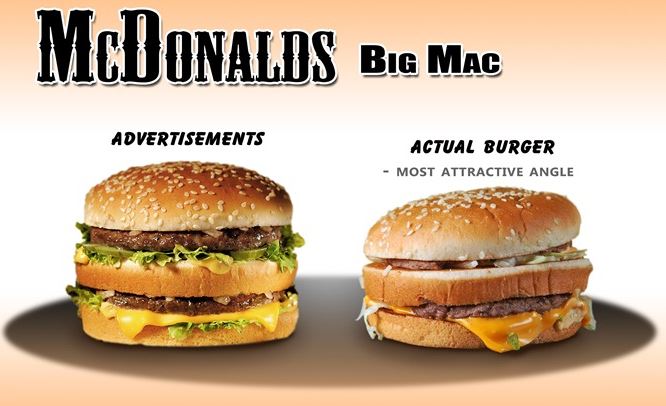
Consumers are savvy and they don’t appreciate feeling misled. To keep brands and marketers to their promise, consumers are taking their own images to demonstrate how the product appears when they received it. The images featured here of the Big Mac – ad vs. a consumer’s reality – is a quintessential example.
This emerging behavior is a great reminder to deliver on our brand promises as part of an image strategy. Expect your audience to generate their wn images and pictures of your brand. The question is, are you giving a product that is ‘photo-ready’?
Continuing the discussion on user generated content, Cara Phillips of Federated Media, brings us back in history.
The Kiss is Gone
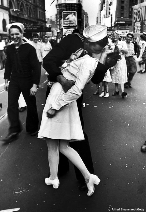
If you’re over 20 years old you’re likely familiar with the picture known affectionately as ‘The Kiss’. It’s a WWII era image of a sailor dipping and kissing a young woman. That single image captured the imagination of the nation and still resonates with many today. But in some ways, the days of ‘The Kiss’ are over. Which is not to say photos don’t work. In fact, it’s the contrary. Photos work so well that we’re all generating our own photos. So in moments of great crisis or emotion, there are hundreds, thousands or millions of ‘photographers’ capturing the moment – not one.

Photos are Art
Phillips, who spends every working hour of her day creating visual content, wants to empower the audience (and marketers everywhere) to think like an artist. ‘Photos are art, it’s subjective. So to be successful publishing images in social, you need to trust your own judgement of what photos are good.’ She then shows 2 different images of a boy with a dog, side-by-side. Both were cute, but boy on the left is being photographed in a ‘Glamour Shots’ like environment and is dawning all white. The boy on the right has messing hair, some dirt on his face and slobbering pooch. The image to the right ‘wins’ with the audience, and it’s not even close. Sorry ‘Glamour Shots’!
Consistent Visual Strategy
Phillips asserts that brands that succeed with visuals in social have a consistent visual strategy. Meaning, not only do they produce quality images on a consistent basis, but the visuals are all connected under a common – overarching theme. Pointing to Nike as a gold standard, Phillips explains that the images have a clear theme to her: our products are there to help you perform physical activities and reach your goals. So whether you are looking at their timeline in Facebook or peaking at their Pinterest boards, you’ll walk away with the understanding of how Nike can fit into your life.
Marketers want data to inform all decisions. It’s in our DNA. And while we ultimately can measure the effectiveness of the images we use in social as it relates to certain KPIs, maybe the biggest lesson to take from this session is we need to embrace our inner artist as well. Know your audience, understand what they like and trust your inner artist to stay true to those points.


