Your brain can identify and retain details of an image in 13 milliseconds. That’s less than a 20th of the time it takes to blink your eyes. So it’s no surprise that visual content is on the rise as attention spans shrink. If you could choose between a consumer spending 20 seconds with a wall of text or 20 seconds with an image, it makes sense to go with the latter.
In other words, people like looking at stuff. As such, infographics are rapidly becoming an essential component of a solid content marketing strategy. Free tools like Canva and Pixlr make it easier than ever to turn your data into compelling visual content.
The best infographics give equal weight to both parts of the word – they combine essential info with stellar graphic design. I could write a whole blog post about how great infographics can be. But, of course, that would defeat the purpose.
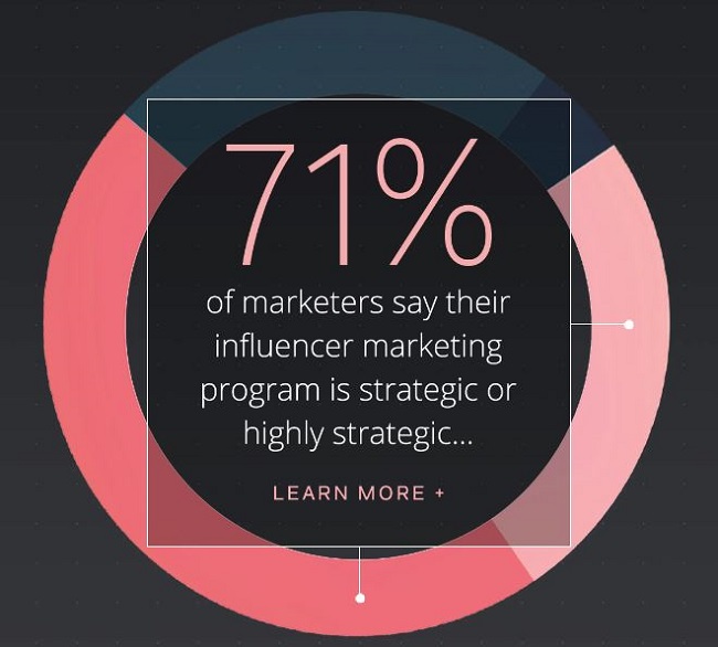
Instead, let’s look at ten great infographics with a meta twist: They’re content marketing assets about content marketing! These examples can inspire your own infographic creation while they inform your strategy.
#1: How to Socialize a Blog Post
Creating great content is less than half the battle for marketers. You should spend roughly 20% of your effort creating, and 80% in promotion. What good is awesome content if no one sees it? This colorful gem from DigitalMarketer efficiently illustrates how to make sure your content reaches your target audience. You’ll learn how to create assets that help promote the piece, make your shares trackable, and analyze your results to do it even better next time.
#2: The Top 8 B2B Customer Marketing Trends to Watch Out for in 2017
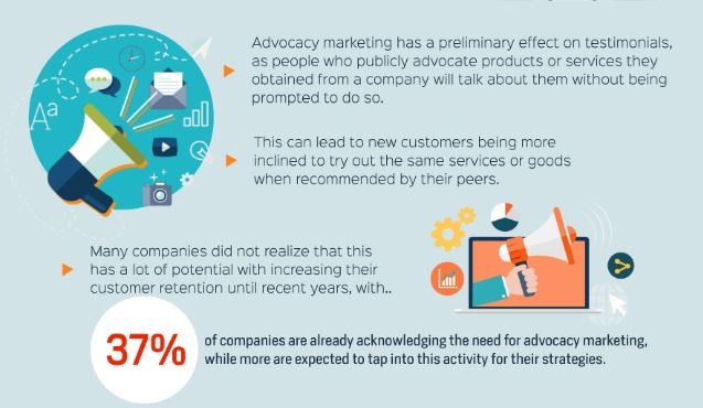
This piece from Digital Marketing Philippines (via the good folks at HubSpot) really puts the “info” in “infographic.” It’s a good example of just how much data you can pack into a visual asset while still keeping it easily-digestible. The bright colors, solid organization, and statistic call-outs grab attention, while the text provides plenty of value to keep people reading.
#3: What Does It Take to Make a Piece of Content?
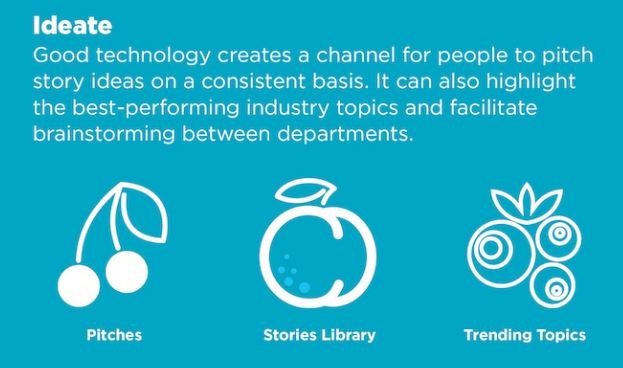
Dive into this cool blue infographic for an insider look at how content powerhouse Contently goes from strategy to creation to distribution. This piece is a great counter-example to the design-heavy look of the previous entry on the list. It relies on simple line art to create a cooking metaphor that provides visual interest without overpowering the text. A soupcon of highlighted statistics help make the case for the solid advice they’re presenting.
#4: The Ultimate Content Marketing Strategy
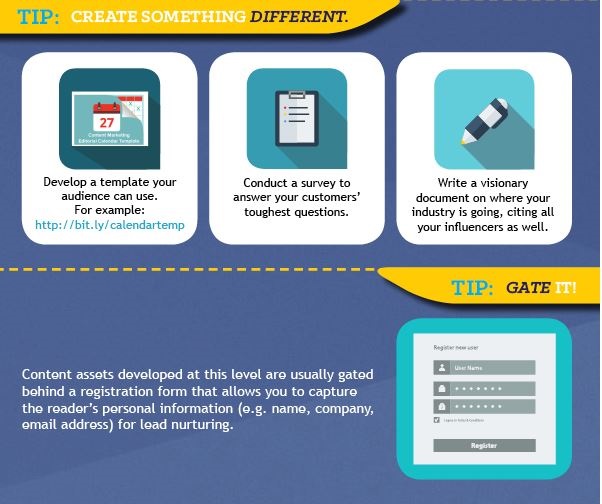
There are plenty of resources out there that explain the “Big Rock” content marketing strategy, but this Curata infographic gets points for thoroughness and nifty graphical interest. Learn how to create a gated asset, slice it into top-of-funnel ungated content that feeds back to the gated asset, then dice it into even smaller gems to share on social media. One nifty trick to steal for your next long infographic: The progress bar at the top that shows exactly how far you’ve read and how far you have left to go.
#5: A Brief History of Content Marketing
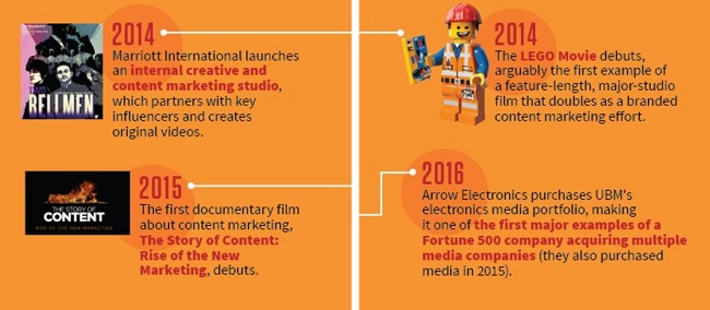
Who better to give a primer on the 200+ year history of content marketing than the Godfather himself, Joe Pulizzi of the Content Marketing Institute? This timeline serves as a reminder that quality content can help build a business, from John Deere’s The Furrow to the Michelin Guide to the Will It Blend? Videos. Wrapped in Joe’s signature orange, this bite-sized history lesson is well worth a read.
#6: 10 Visual Marketing Statistics for 2017
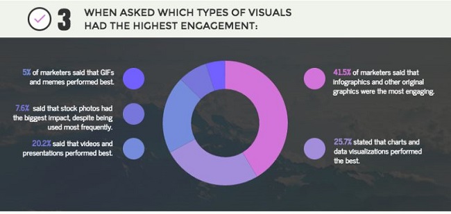
This infographic collects results from a Venngage survey of over 300 digital marketers. It’s a great resource for seeing how the industry is moving toward visual content, and what types of visual content are leading the pack. Compare your progress to the results here, or use it to inspire your strategy, or just enjoy the pink-and-purple visuals.
#7: The Ins & Outs of Awesome Infographics
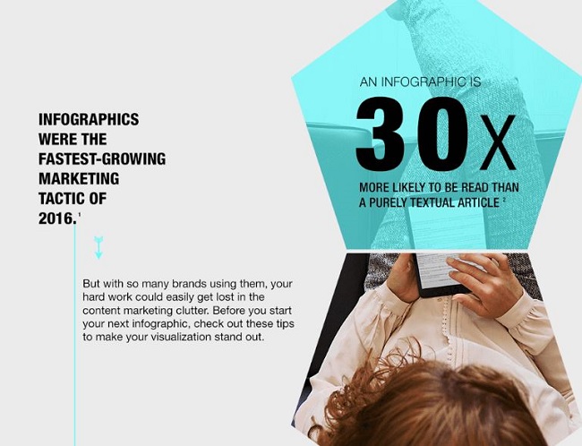
Fans of marketing, infographics, and pentagons will enjoy this groovy piece from IBM. The simple, clean design work complements the solid advice on offer about how to create memorable visual content. Learn how to choose the right visuals for your data, pick the right layout, and avoid common mistakes.
#8: What Buyers Really Want from Content Marketers
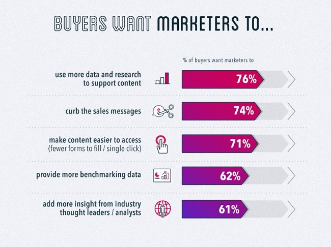
The team at Uberflip demonstrates a lesson well worth learning in this piece: Not every infographic has to be six screens tall. They manage to pack a wealth of data into a fairly small space, distilling the message into something that gets the value across without spraining your scrolling finger. Find out what buyers want marketers to do, and not do, to create content that really resonates.
#9: The Importance of Visual Content
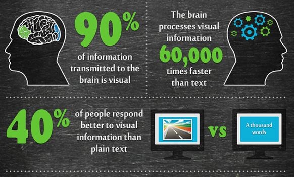
You don’t have to have a team of researchers and designers to create a solid infographic. This piece from kwikturn media is a good example of doing more with less. It’s essentially a stats blog post, compiled from sources around the internet. Add some thoughtful but simple clip art, a slate background, and it’s far more interesting than a text list would be.
#10: The Secret to Creating Scalable, Quality Content and Better CX
Static infographics have more visual interest than text does. But you can take it a step further with an animated, interactive infographic. Some people call these “gifographics.” Those people are wrong. But whatever you call them, they’re undeniably cool. We created this interactive piece on the Ceros platform.
Infographics are an indispensable part of a modern content marketing strategy. Use them to highlight data points from your gated content, replace a list-based blog post, or just to brighten up a how-to post. Just keep the design simple and clean, and the text informative and valuable.
Seen any cool infographics lately? Let me know in the comments.
And if you need help creating your own infographics, check out our content marketing services.
