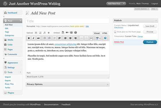
It wasn’t long ago when WordPress 2.5 came along and the admin side of the blog was completely re-designed. It was a welcome upgrade, but it seems it was met with mixed emotions and so WordPress decided to do some usability testing.
What they found out was that the redesign was still frustrating some users. WordPress worked to move some things around and tested prototypes against the test panel. Before they knew it, they came up with a new layout that tested far above the current admin interface. People were able to get things done much faster and were overall very happy with the prototypes; even though the prototype design was ugly. So this is why WordPress 2.7 comes with another administration redesign.
The new screenshots are very nice. The menu goes down the left side and that brings the more important information up on the page. This is a welcome update as the menus take up a lot of room and there is generally a lot of scrolling in the 2.5 and 2.6 versions of WordPress.
All the same menu options and features are still there, it’s just re-learning where they are. Hopefully it’ll be easy to adapt to.
As WordPress 2.7 gets closer, expect more tweaks to the admin interface that polish up the look and feel, along with usability, even more. It’ll be a big change, but I’m excited to see that it’s focused on usability more than just a re-design.


