 As the use of cell phones and smart phones expands, so do the number of options for consumers to discover and interact with brands. From web browsing to email to social networking and even shopping, more people are using their cell phones as portable computers. However, most sites are not optimized for hand-held devices such as cell phones.
There are really two things to consider; web site design and how customers are going to find the web site through mobile search.
How do you design for the mobile platform? The good news is that in most cases, you don’t need a separate site, you just need a cascading style sheet (CSS) attached to your website that feeds up specific instructions to a mobile browser. For the most part, mobile browsers are a lot like the web used to be; mainly text and links. Granted, as the iPhone, Google/Android Phones and other more advanced devices come along, the browsing features also advance. Most smart phones like the iPhone view the web as it should be without anything stripped out. But, since everyone doesn’t own a smart phone just yet, it’s worth focusing on the what the mass mobile market has, basic handheld web browsers.
When designing your CSS for handheld web browsers, here are a few things to consider:
- You have very limited screen real estate. About 2×3 inches or so.
- All fonts should be in their most basic format. Forget about color and typography.
- All images should be striped out, unless they are absolutely necessary.
- Remove all advertising as you already have limited screen space.
- If you don’t need it, hide it. Remove any Google Friend Connect, Facebook Fan Box or other third party services. Focus on your content.
- Remove all background colors. Basic black text on a white background is good.
- Create basic forms, if you choose to keep them. My advice would be to remove them and just showcase the phone number. They are on their cell phone after all.
- Remove Flash, Java and any plug-in content unless absolutely necessary.
- All in all, simplify.
If you run a WordPress blog, you can use a WPtouch iPhone Theme plug-in to automatically create a small-screen friendly version of your blog.
If you want to view your site as if you were on a mobile browser, here are a few choices:
- Web Developer extension for Firefox. It allows you to overwrite the web style sheet with the handheld one if a site has one. If not, it’ll just show the site without any CSS styles.
- iPhone simulator called iPhoney. It looks cool, but since the iPhone really doesn’t render a striped down version of a site, it’s more of a toy.
- Opera Mini browser. There is an online version and it’s free. Simply put in a URL and it’ll render a website as if it was on a mobile phone.
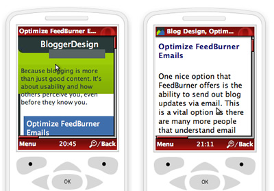
From my testing, the Opera Mini browser was a great experience. It has a small screen, shows handheld versions of style sheets and all in all, it does a great job at giving you what a real phone will show. Here is my before having a handheld CSS and after experiences on the Opera Mini browser.

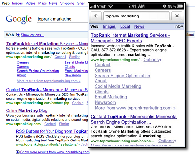
So where does SEO fall into all of this? Is there a separate ranking algorithm for mobile devices? No, not from what I can see. While smart phone users can type or speak their search queries, the sort order rankings are fairly consistent between a search on a phone and a search on a computer.
Here’s an example with Google search on an iPhone and at Google.com.
The best way to ensure you are found on mobile devices is to make sure your site is in all the local search directories with full and accurate profiles. Places like Google Local and Yahoo local probably receive more traffic from users who want to find business in a certain area. When I’ve used my phone to search the web, I was searching for specific businesses to visit. Social networking through mobile is also popular and through links, can drive web site traffic. A combination of search and social is the direction where I see the bulk of mobile traffic going.
Mobile search is an area of the Internet that is finally heating up which is supported by predictions made by eMarketer. Some marketers are putting a lot of stock into mobile marketing as cell phones and smart phones become more widespread and offer more capabilities. However, site owners are not always taking those platforms into account. To ensure your site is mobile ready, get listed in local directories and add a handheld CSS file to your site. These two easy items are a great start for optimizing your site for handheld web browsers.


