On the occasion of the new trailer for Fantastic Beasts and Where to Find Them, I was thinking about the fantastical wizarding world of Harry Potter. Who wouldn’t want to live in a world with magical items like pictures that move, newspapers that automatically update themselves, portraits that speak?
Then it hit me: My smartphone can show moving pictures and auto-updated news, and it doesn’t have to be delivered by owl. AND it’s a lot more compact than the average Daily Prophet issue. Sure, we can’t play proper Quidditch yet—someone get Elon Musk on flying broomstick development—but as far as interactive content goes, Muggles have got it on lock.
The point is, content can do a lot more these days than sit on a screen and look pretty. Are your content marketing efforts taking advantage of that fact? Do you invite your readers to participate in an experience? Or are they left doing this?
There are dozens of ways both subtle and flashy that you can add an extra kick to your content. Here are five to get you started, complete with examples to interact with.
#1: Make Data Extra-Relevant
Say you have a big set of data that relates to 12 different verticals within your target audience. You could make a dozen different infographics. You could write a dozen different blog posts. If you were feeling really sadistic, you could mash all the data into one content source and let each vertical search for the relevant info.
Or you could start with a template, let the user pick which data sources they’d like to see, and watch the most relevant info magically fill in. That’s what LinkedIn did, with the help of the wizards at Ceros, for their Where to Find Talent in the United States infographic. Pick your industry at the top, and it fills in the template with customized data.

Numbers fly in as you scroll down, delivering exactly the information you were looking for like a Hogwarts owl on a mission. It’s a neat way to make sure each viewer finds exactly what they’re looking for.
#2: Allow for Automated Hyper-Personalization
Checklists are a go-to content type that content marketers use to add a little extra value. It gives your reader a condensed version of your content, all action items, no filler. Readers tend to enjoy checklists, too—they perform well as a gated asset or as a stand-alone.
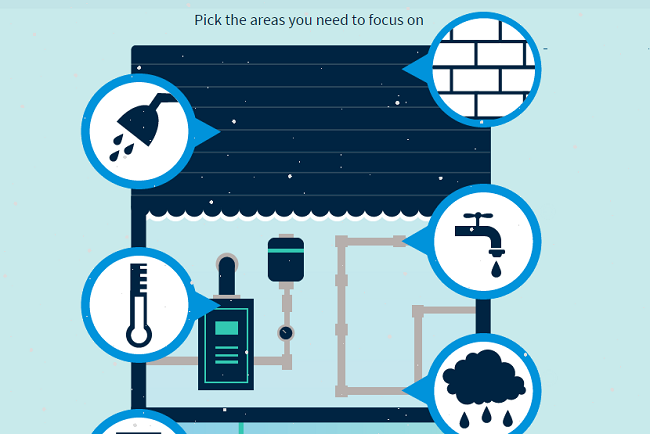
But you can improve on the humble checklist by making it interactive. Let your audience pick the most relevant points and compile their own list automatically, as in this interactive infographic from Cross Country Home. SnapApp helped the home maintenance company create the infographic, which allows the reader to choose areas of particular concern, then generate a customized to-do list (after ponying up an email address).
The interactivity makes the checklist far more valuable for the reader, and justifies having the end report gated. It also introduces an element of discovery with clicking on each icon—which might lead to readers spending more time with the content.
#3: Tell Readers Something about Themselves
Let’s face it—we love looking at ourselves, talking about ourselves, taking pictures of ourselves, and learning about ourselves. Don’t chalk that up to millennial narcissism either. Some of the earliest photographs we have are self-portraits (not to mention all the old-school self-portraits from painters and sculptors).
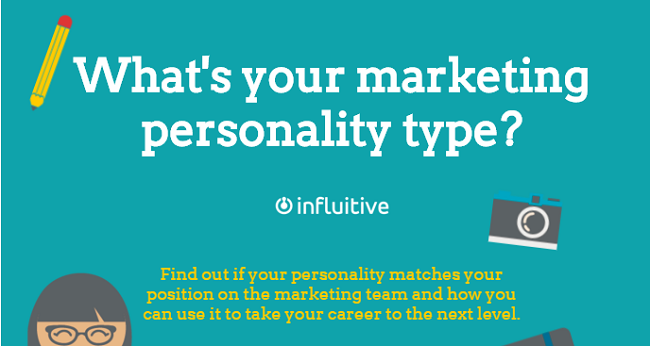
You can capitalize on the joy of self-discovery with quiz-based content. From personality quizzes to identifying your Patronus, quizzes are irresistible. Especially so when they’re about something that matters, like Influitive’s “What’s Your Marketing Personality Type?” quiz.
This quiz gets bonus cool points for not making you click to a new page for every question. SnapApp created a single, linear-scrolling experience that removes obstacles for completion.
Take note of how Influitive presents the results: There’s your marketing type, a description, and then a brief paragraph on skills your type might need to further develop. Right under that—an eBook offer! What a perfectly logical next step.
#4: Present a Ton of Info in a Visually Compelling Way
This next example takes what could have been a blog post or a slideshow, and makes it something that’s a lot more fun to play around with. Even if the information is familiar, or common knowledge, a novel presentation can make it worth a second look.
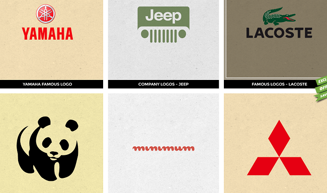
Designhill created this interactive guide to famous company logos. It presents itself as a seemingly infinite grid, with logos lined up in rows just waiting to be clicked so they can reveal their secrets.
As you scroll and explore, you’ll notice some of the tiles are calls to action: Create a Logo, Get a New Graphic Design, etc. These CTAs are inobtrusive but designed to be spotted after you’ve had fun playing with the content. And if you happen to miss them, there’s a CTA in each of the info pages that pop up when you click a tile.
#5: Bring Together Disparate Elements
No one’s product exists in a vacuum. Unless you sell vacuum bags, and even if you do, that’s not what I meant and you know it. Your target consumer has an entire life outside of their relationship with your product—and many aspects of that life also involve interaction with other products. Interactive content can help you address the larger context of your audience’s lives.
This fantastic Summer of ‘66 widget from Asos is a prime example of that kind of synergy—not the bad, buzzword-y kind, but a genuine combination of separate elements to make something groovier than the sum of its parts. Pick your 60’s style, and get music recommendations you can buy on Amazon or iTunes, clothes from Asos, and a Spotify playlist to stream immediately.
It’s a triumph of great design, effortless cool, and actual utility, inviting readers to customize an entire experience, not just a look or a sound. I’m just sad the sweepstakes to win that turntable is over.
Expecto Engagement!
In this age of wonders, we don’t have to stick to old Muggle methods of content marketing. Text will always have its place, of course. There’s no substitute for good old-fashioned long-form content. But your audience will appreciate it if you conjure up interactive experiences that enhance your quality content.
What else can interactive content do? What has your team created that dazzled your audience? Let me know in the comments.
Disclosure: LinkedIn Marketing is a TopRank Marketing client.
