While B2B marketing KPIs such as views, shares and impressions are important in helping to determine your digital marketing strategy, conversions will always be more important. You have to provide enough value to encourage people to click on your content, and then once they reach your destination, you have to convince them again that it is worth providing their contact information.
Landing pages can be an incredibly powerful tool for moving prospects through the sales process but they are not all created equal. Oli Gardner of Unbounce provided an incredibly amount of information on the four corners of conversion for landing pages in his presentation at MarketingProfs B2B Marketing Forum.
Oli’s presentation helped highlight the most important element of a landing page, the customer. Your customers should never be confused, angry or annoyed when they’re trying to work with our marketing campaigns. Unfortunately, that’s sometimes the case if the copy doesn’t resonate, the design isn’t right or it’s difficult for them to interact with the campaign. Here are 13 lessons on landing page copy, design, interaction and psychology.
#1 – Distraction Is The Enemy
There is no reason you shouldn’t have a dedicated landing page for each marketing campaign. This will enable you to better hold the attention of your customer, get you closer to a 1:1 attention ratio and increase conversion rates.
#2 – Flip Your Headlines
Ask yourself, what does your headline and subhead say about what you do? Sometimes, the content for the headline and subheading may both be correct and well written, but they’re in the wrong order, which can dramatically decrease your conversion rates.
Oli recommended using a tool like UsabilityHub to run some quick tests on your landing page content. This tool compiles data from real users to see if your content resonates.
#3 – Voice of Customer
If you are having trouble creating clarity with your headlines, reach out to some of your customers and ask if they can help. Customers have nuggets of information and a perspective that you may never have thought of. In the end, it’s about what they think, not how you describe yourself.
#4 – Use Language That Builds Trust
You have limited space and time to convey to your visitors that they can trust you and should feel comfortable providing their information. As children we were taught to trust words like “because” which was typically followed by sound reasoning. Research has found that using the word “because” 19 times on your landing page can create a conversion rate of over 25%. Additionally, there are different levels of trust based on who is featured in either copy or visuals on the page. Experts win out over CEOs almost all of the time.
#5 – Guide Focus
There are ways you can get people to focus on what you want them to focus on. Understanding A.D.D. principles makes design more fun and more effective by creating a common design vocabulary. Make the one thing that you want to stand out – stand out. By making it different.
#6 – Be Careful When Following Design Trends
Many design trends seem like a great idea at first, until you understand how they truly impact your visitors. Be wary of jumping headfirst into a new design until there is enough data to show that it improves the user experience. There is a term called “Scroll Jacking” which means that when a customer is trying to look at individual elements on your page the design makes it impossible for them to stop scrolling and land on their area of interest. This issue can easily create a bad customer experience if they can’t stop the scrolling.
#7 – Caption Visual Elements
According to Oli, the captions included under images or videos are read an average of 300% more than the actual body copy. If you’re going to include either of these elements on your landing page, make sure that you create a compelling caption that makes your audience want more.
#8 – Keep Ideal Customers Top of Mind
Avoid designing landing pages for the masses and instead focus on your ideal customers. This affects all elements of your page including design and copy.
#9 – Follow Affordance In Design
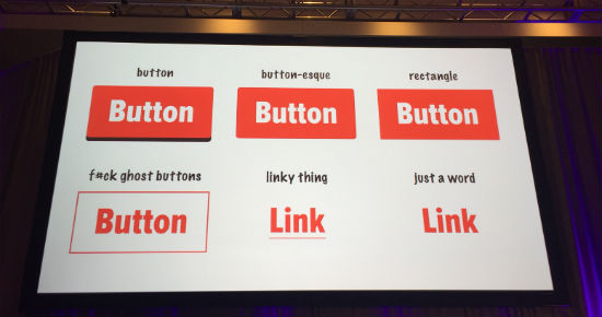
The visual design of your landing page should easily convey to your audience how it can be used. The example below is of different button types that are typically used in design. You want it to be undeniably clear that a button is clickable.

#10 – Proximity of Page Elements
Page elements that are in close proximity to one another are perceived to have a relationship. Putting items close to the page call to action can be a threat to your conversion rates and must be tested.
#11- Approach Carousel’s Wisely
A carousel element allows you to have more information on the landing page, without cluttering the page. The downside is that often time’s carousels can cause confusion and decrease your conversion rate due to autoplay functions, mobile incompatibility and more. If you do want to include a carousel, consider having labeled tabs that are easy for customers to click on. If certain tabs don’t convert, remove them.
#12 – Video Position & Size
Videos on landing pages perform best at the top of the page and should follow consistency in sizing to work well for both desktop and mobile users. Many marketers wonder if landing page videos should be set to autoplay once someone hits the page. If you have a thumbnail that someone clicks on in an email the video should start playing as soon as they hit the page, otherwise no.
#13 – Call To Action Language
Having the right verbiage on your call to action can dramatically impact conversion rates. While many people may think that including the word “free” on a button will increase the conversion rate, the opposite is actually true. Incorporate action words such as “click” to reiterate to your audience what you would like them to do. Create urgency with words like “now” to encourage immediate action.
Start Creating High Performing Landing Pages Now
The tips above only scratch the surface of the wealth of information that was shared during this presentation. Fortunately, they are all things that you can begin implementing now for new and existing landing pages. If you’ve created landing pages in the past, what did you find impacted your conversions the most?


