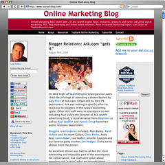
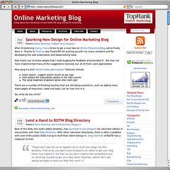
The Online Marketing Blog got a face lift today as the new design was made public. I’ve spent quite a few hours on it the past couple of weeks and I’m very pleased with the outcome.
The new design cleans up the look and feel quite a bit. The header area has been condensed a little and the menu has been re-worked stand out a bit more. The design also removes the left column and gives more room for posts. This is a big feature as it gives the ability to post bigger pictures and long posts don’t look quite so long.
Other features include:
- More prominent RSS icon with a drop down menu that includes the feed buttons.
- No tables, all cascading style sheets (CSS).
- A few social bookmark icons followed by a drop down social bookmark menu with many other choices.
- A live, ajax search box.
- Separate pages for archives and resources.
- Fancy quote boxes.
- Overall, design upgrade.
The feedback so far has been quite positive. The trick now is to keep the clean and organized look and feel as the weeks and months go on.


[tags]online marketing, blog, toprank, css, re-design[/tags]


