Do you remember when great content marketing meant your copy was properly optimized for search engines so your customers could find you when searching?
Today’s customers have raised the bar, and it’s time that content marketers follow suit. As marketers, we have a unique opportunity to create a more one-to-one experience with our customers and prospects through the use of compelling visuals.
Recent research from Content Marketing Institute has found that content containing relevant images gets 94% more views than content without. Additionally, social content containing visuals typically receives 150% more retweets when scheduled using tools like Buffer.
Creative visuals have the ability to connect your audience to your message and engage them to the point of sharing, purchasing and advocating for your brand. Every piece of content that you create whether it be a social message, blog post, eBook or video – presents an opportunity for telling a story to make a connection with your audience.
Below you’ll find insights into 5 ways that you can begin incorporating BETTER visuals into your content marketing, and brands that are breaking barriers to create an experience for their customers.
#1 – Turn the Focus on Customers to Create Authenticity
Creating shared experiences between current customers and potential customers is a surefire way to tell a compelling story. The more your audience can relate to the people they see in the photo, the more impactful your message will be.
Quicksilver recently announced the winners of their junior surfing event, King of the Groms. While other websites covered the event in great detail, Quicksilver created one post entirely dedicated to showcasing these amazing surfers posing for the camera, and in action on their boards.

StabMag.com (a website about everything surfing) also covered the event and featured these amazing surfers by creating a short biopic video of their experience.
#2 – Provide Visual Guidance for Your Audience
Even if customers are purchasing items online, they want an experience. When you walk into a storefront business you’ll likely hear music, see clothing items styled on a mannequin and have the assistance of a sales person. A similar experience can be created for online customers by reaching outside of simple product pages, and showing customers real-life scenarios.
Take for example the clothing company StitchFix. What’s unique about this brand is that customers don’t even know what they are purchasing, until it arrives on their doorstep. When the customer opens the box they’ll find suggested ways to style the clothing in their box. Also, StitchFix’s blog provides great resources on how to style different types of clothing that are popular right now.

These visual aides can often be the difference between shipping back an order, and keeping the entire box. Trust me, I know.
#3 – Explain an Often Misunderstood Concept
Sometimes using words to describe a concept simply isn’t enough. It could be a complex business process or new product, either way, there’s an opportunity to help your readers understand the message you’re trying to convey through visuals.
HubSpot recently wrote a blog post detailing how you can survive a business dinner by escaping making common mistakes. When attending an important meal, it’s essential that you understand exactly which fork to use for your salad and which knife should be used to cut your steak.
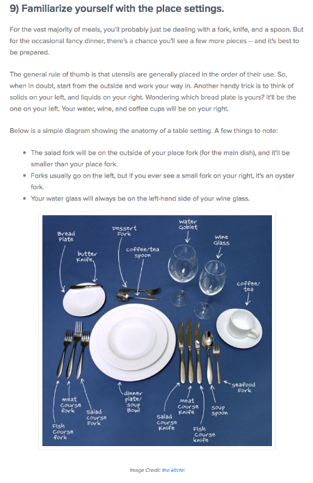
For the majority of us that don’t know, HubSpot included a visual representation of how to use each piece of cutlery and dinnerware placed before you at a nice restaurant.
#4 – Showcase Innovation
What do you think is more impactful? Telling your audience about your brand’s innovation, or showing them what it actually looks like?
Volkswagen recently posted images of a concept car that they created and would be unveiling at a tradeshow in Las Vegas. Not only did followers get a sneak peak, but the images also served as a teaser to entice people to attend the event.
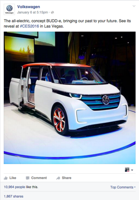
Relying on words alone to paint the picture would not be as effective as showing your audience what they could experience, or what they would miss if they didn’t attend.
#5 – Incorporate Some Whimsey
Sometimes it’s important to incorporate compelling images that speak to the whimsical side of your audience.
Oreo does a fantastic job of incorporating beautiful images and interpretations of their product on the company Instagram page. Their combination of dunkable videos, to gravity defying Oreo balancing acts will literally make everyone want to run to the store and buy a bag of their product.
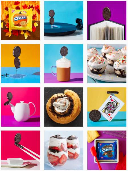
It doesn’t matter if you’re 10, 50 or 100…Oreo uses visuals to create mass appeal.
Make Your Visuals Matter
Some companies have unlimited resources at their disposal to create one-of-a-kind images and videos to infotain their audience. For those of you that don’t, the next step in the evolution of your visual content can simply be putting a thoughtful eye to the visuals that you DO have access to.
That means, adding your own flair to stock images by creating effects and text that differentiate the visuals. What are the most compelling images that you’ve seen in content in 2016 thus far?
Header image via Shutterstock


