 Visual content is certainly trendy – see the meteoric rise in infographics and social engagement with images as proof. Yet the need for content that appeals on a visual level and presents information in a more engaging format than text goes far beyond what is cool or fun to create.
In creating curriculum and learning materials for students (child to adult) and their teachers, I learned just how important visuals are in meeting the needs of different types of learners. This is too often a missing piece in the marketing mindset; we focus on what we want people to do, the action we want them to take. We think of learning styles in terms of learning disabilities, yet the ways in which every person on the planet takes in information should be a major concern for marketers, whose express purpose is to get people to take in information.
Through your content, you may be inspiring, engaging, entertaining. What you are doing though, at the basic level, is teaching. You want your audience to understand the information you are sharing. You want to influence their decisions. Empowered consumers seek out information to help them make the best decision, often considering multiple sources.
Now pair this customer insight with what we know about how people learn: the majority of people are visual learners, either primarily or in combination with other styles. You’ll see a range of stats on the percentage of learners in each group, though 30% visual, 25% auditory, 15% kinesthetic and 30% mixed learning styles is a commonly accepted figure. These are the three major learning styles and though one person may use a combination of styles to take in information, we all lean towards one primary preference.
Kinesthetic learners best retain information they discover through touching, feeling and experiencing material. You might think there is no real “touch” in digital information, yet this is where interactive games and touchscreens are an important tool.
Auditory learners consume and retain information best by listening, often through repetitive information. Podcasting is a good way to connect with auditory learners.
Visual learners, the largest portion, want you to “Show me so I can understand.” You might accomplish this through charts, infographics, video demonstrations, comics, visual e-books, photos, or even animation… the point is, you are acknowledging this unique learning style and tailoring information for best consumption and comprehension.
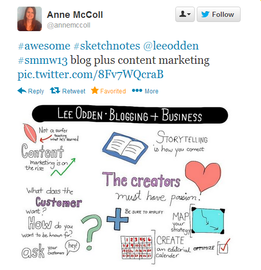
We saw a fantastic example of a visual learning style recently at Social Media Marketing World, when an attendee shared her visual notes from Lee Odden’s presentation on blogging for business. Taking in auditory and visual information, this person sketched notes rather than writing them, in order to more easily recall the information she wanted to retain later on. It resonated with the social community because others learn this way, as well.
This understanding of how people learn, consume information and are influenced by it lies at the heart of everything we do as online marketers: user experience, content creation, web design, social media marketing and even search engine optimization. We know visuals are important for engagement and social sharing, but understanding the “why” will help you create and optimize content that is truly in tune with your audience preferences.
Now that we know the “why,” check out these examples of companies getting it right with visual content that inspires, engages and most importantly, presents information in a way prospects can understand and retain.
General Electric – Show Me How It Works

General Electric houses their images on Instagram (above) and Pinterest, though they use these same images in blog posts and across their social channels. Their Instagram images, in particular, focus heavily on showing their B2B audience how their products work in real life. Who wants to see a piece of a machine? Show me how it works! They do, and the result is that prospects can picture GE products in action for their own company.
Kellogg’s Pop Tarts – Show Me a Story
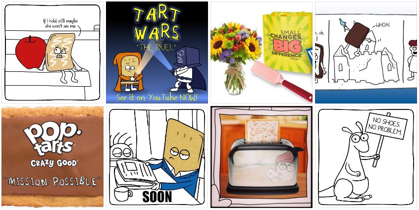
The Pop Tarts Facebook Page showcases their masterful visual storytelling skills. Their brand marketers use comics, cartoon characters, and simple images to present information in a fun and engaging way. Their strategy is to entertain, to keep their audience engaged and their brand top of mind. These quirky images are perfect for social sharing and tell stories through single images, or image series released over a period of hours or days. They even have recurring characters who pop up now and again, breeding familiarity and creating anticipation. It’s a winning visual content formula for a B2C brand in a competitive market, where every touchpoint counts.
Rubbermaid – Show Me Why I Need It
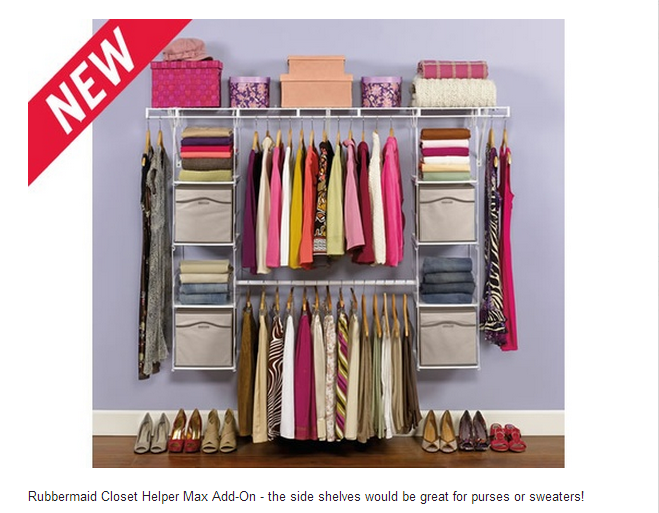
Look in your own closet. Now look at Rubbermaid’s closet organization images on Pinterest. Back to your own messy closet. Now back to Pinterest. Rubbermaid shows consumers precisely why they need their product with attractive, high quality photos shares to the social networks their audience members frequent. My closet looks nothing like this. I need Rubbermaid.
Callaway Golf – Show Me How to Use It
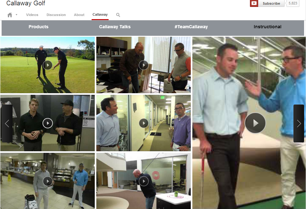
Golf brand Callaway has their YouTube channel organized into different types of videos, including instructional clips for golfers. They create videos in series, such as Office Golf Tips and Bones at Work, to create consistency and build anticipation for coming videos. Celebrities like Phil Mickelson appear in their instructional videos to show golfers how to improve their game… using Callaway clubs, of course. Teaching a golf swing absolutely requires video; you would have a hard time learning from written instructions. Callaway just does theirs better than most and have become a reliable resource and authority for golfers, as a result.
Show Me
As you plan your visual content, think hard on the “why.” It’s not about what you want to tell people. What do they want you to show them, to help them make an informed decision and stay connected with your brand? You absolutely must understand what your audience needs you to show them in order to engage and convert, especially when they are bombarded with imagery on a daily basis. This insight and customer-centric perspective will help drive your visual content strategy and you will never run out of creative stories to tell with compelling content.
What factors do you consider when planning and creating visual content in your organization? Share your thoughts in the comments!
Image at top from Shutterstock.


